
| Client | Project for Coursera |
| Sector | Web design for mobile and desktop, App design, Chat/mailing/SMS feature |
| My Role | The entire product from research to low-fi prototype testing, to mockups and hi-fi prototype. |
| Project Time | 3 months |
| Software Used | Adobe XD, Microsoft Excel |
Why This Project?
I wanted to develop a chat feature to help reduce loneliness and isolation, especially for elders. Because I know that some elderly people struggle with technology a lot due to presumed knowledge, especially when dealing with chat features, I wanted to make a solution that was very simple, easy to use, and had readily available tutorials to explain various functionality. I believe that the features I added for this will help more than just the elderly, but people who are have disabilities that makes it hard for them to go out and socialize, and the next billion users.
Baby Steps: Personas, User Journeys, and Sitemap
To solidify the foundation of this project, I created personas, user journeys, user flows, a sitemap, and conducted a competitive audit. Since there was no preexisting business template for this, it took much longer to figure out the angle I wanted to approach for this project.
Target Audience and Competitive Audit
As with any product, the first step was to do some research on the potential target audience for GENCHAT, as well as review any pre-existing competitors. GENCHAT’s target audience ended up being:
- Older adults who live alone
- Younger children in grade school
- Teenagers
- Young adults who feel isolated
- Anyone who could use the service to combat loneliness
If you are interested, please feel free to read my Competitive Audit Report.
Personas
Taking the target audience from above, I went forward and created some personas with the information.
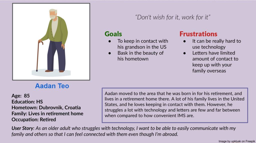
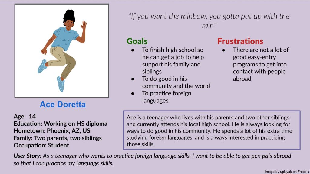
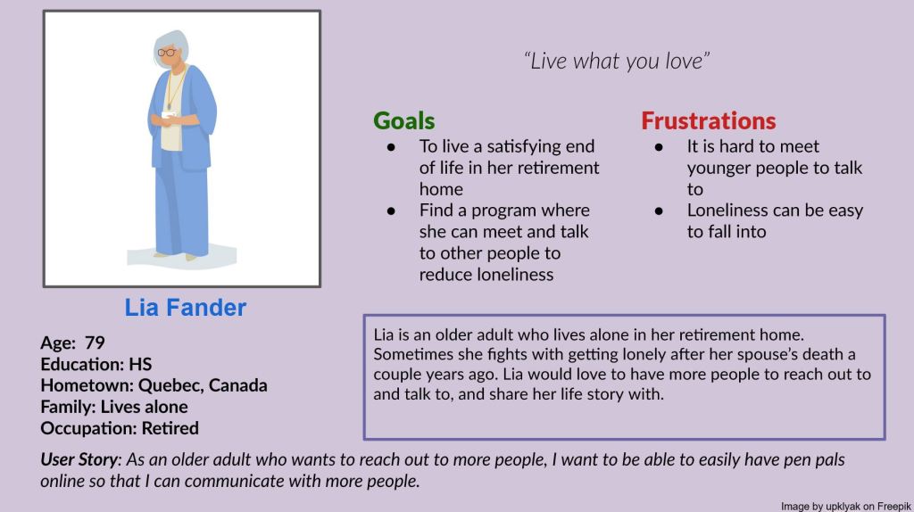
If you need a screen reader friendly version of these images, please review this alt text.
Problem Statements
Next step was to create some problem statements for my persona populaces:
- Lia is a retired Canadian adult who wants a way to meet new people because she is currently battling loneliness.
- Aadan is an older adult who needs a better method to contact his grandson because other methods are too slow, inaccessible, or complex.
- Ace is a young language student who wants to connect with people around the world because he wants to build his language skills.
I came up with another use for GENCHAT at this point: it could be international, and double as a service to help build language skills for those looking for Pen Pals.
User Journeys
To figure out how GENCHAT was going to be set up and how it would flow, I went ahead and made user journeys for each of the personas I had made previously to see how they would navigate the system.
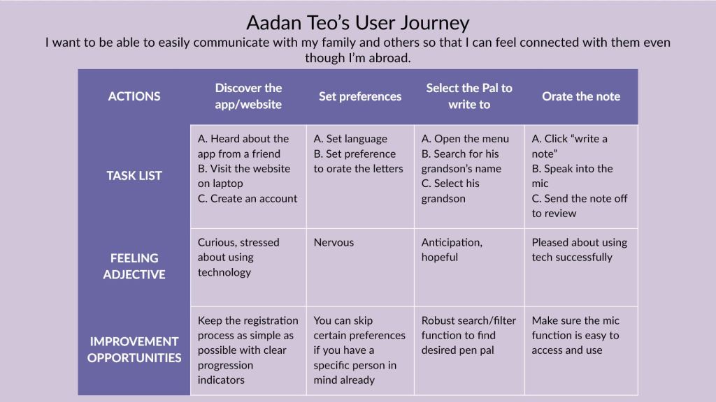
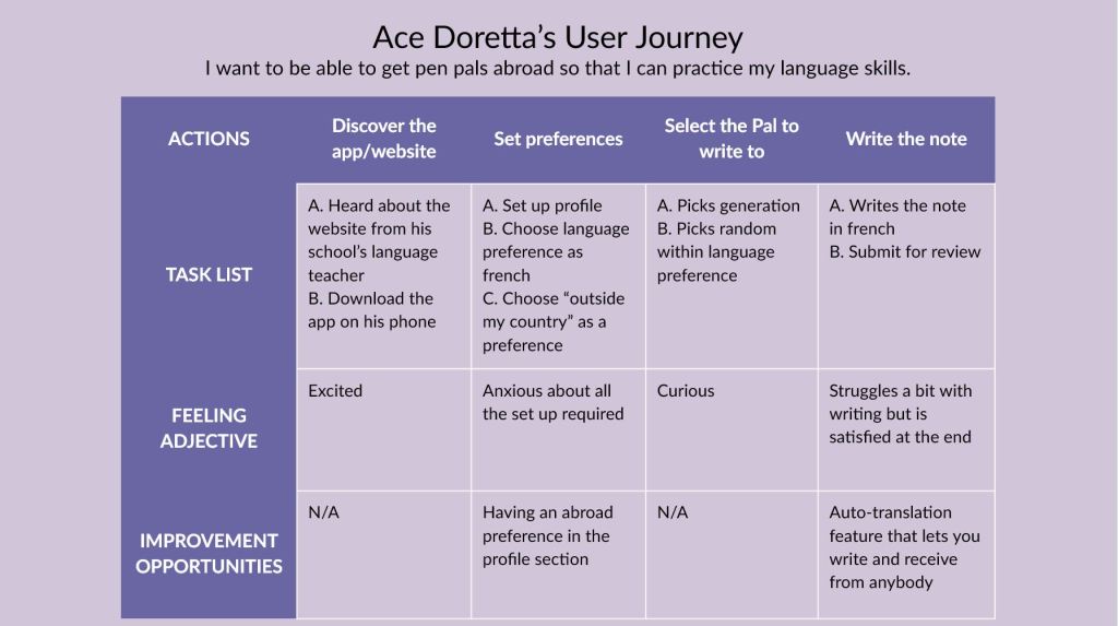
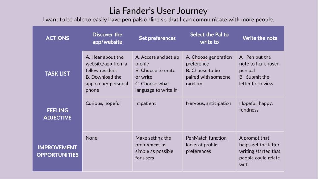
If you need a screen reader friendly version of these images, please review this alt text.
Here are the insights for potential pain points that I got from the user journeys and previous research:
- It is not easy to find a preexisting pen-pal program meant for inter-generational letter writing
- Some people cannot write or type, speak-to-text technology could act as an equalizer here
- The product would need a low bar of entry for people to actually use it
- Sometimes people don’t know what to write about, a random prompt can help people connect through stories
- Make sure that people can have overarching settings, but it is easy to swap
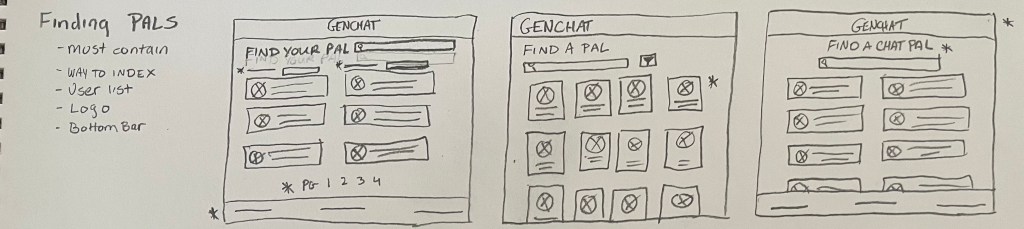
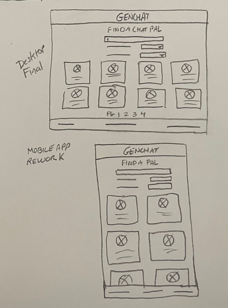
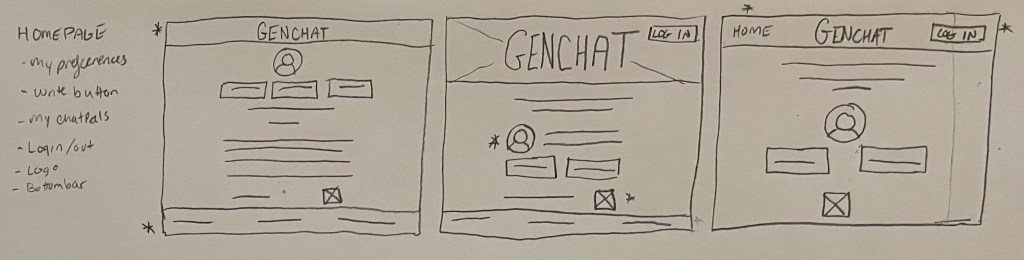
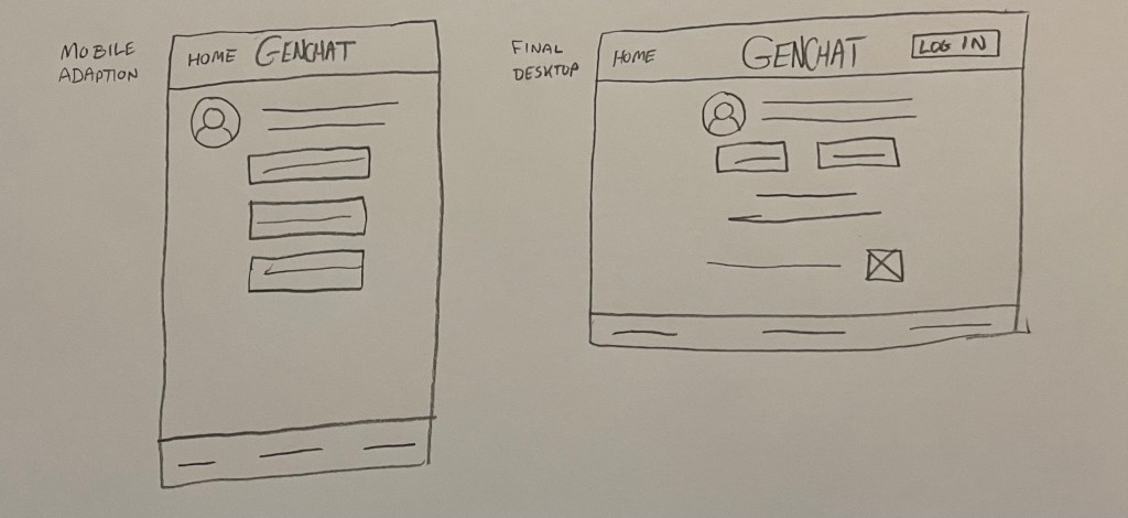
User Flows and Paper Wireframes
After finishing with the user journeys, I had a better idea of how the app and desktop versions were going to flow through.
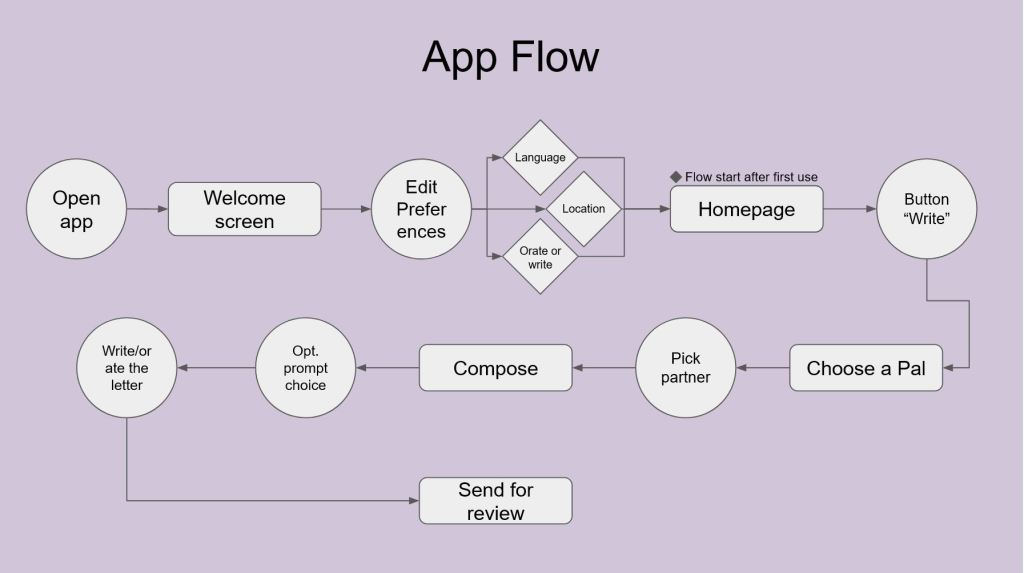
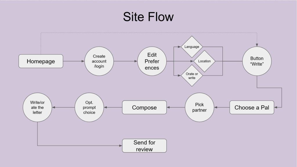
These helped me draft up some paper wireframes so that I could begin thinking about what my low-fi prototype would look like.
Walking: Prototype, User Testing, and Iteration
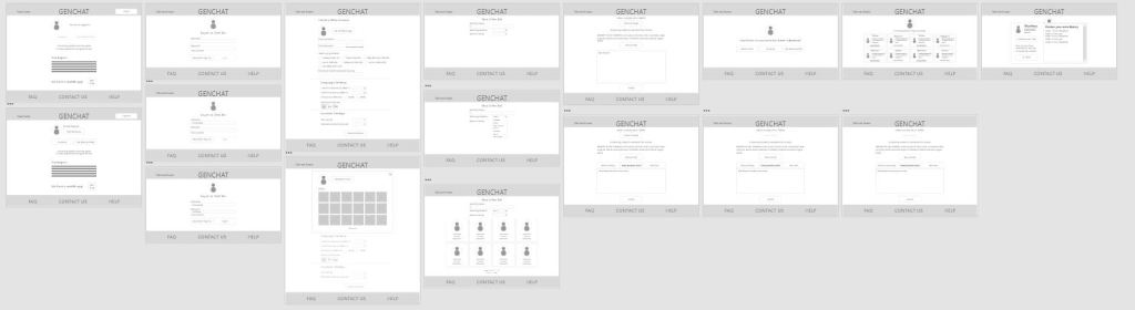
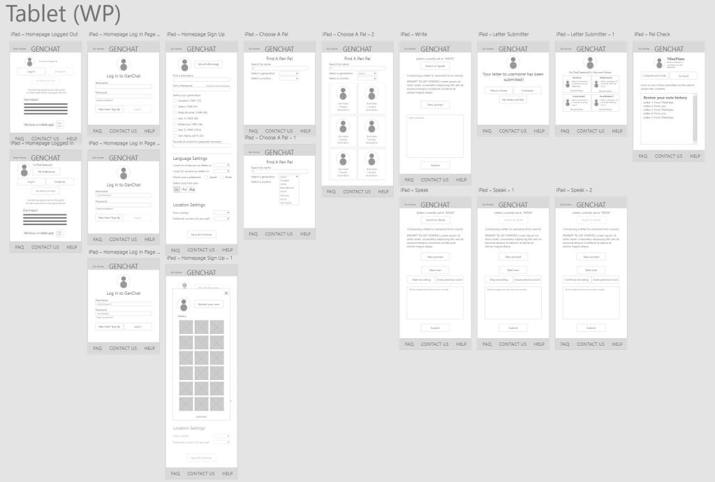
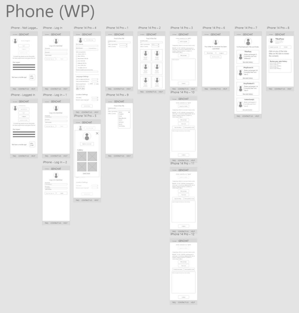
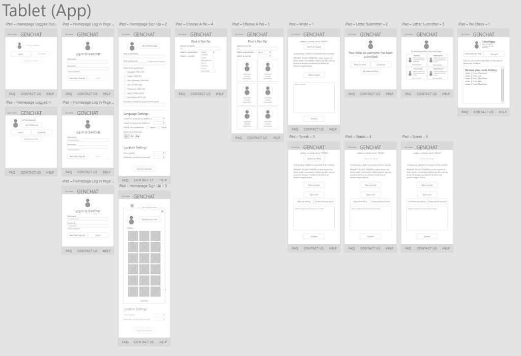
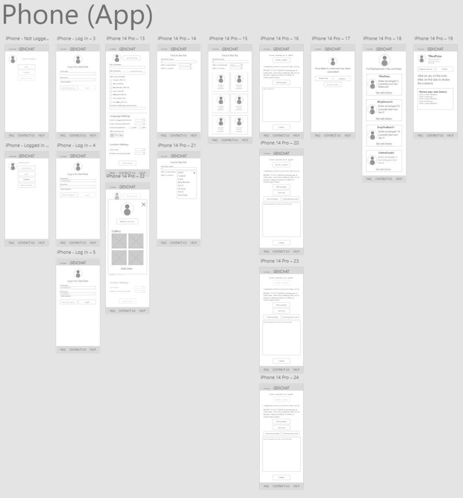
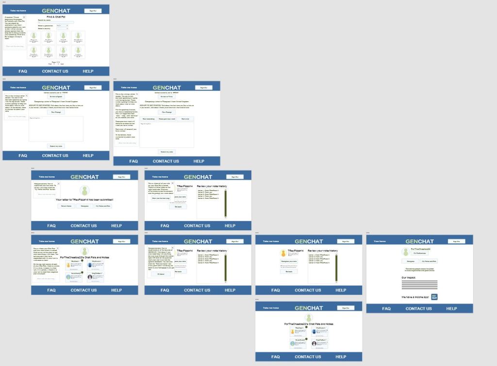
I created five wireframe versions of various screen sizes for GENCHAT, two for the app, and three for the website. These were meant to really hash out how the features would sit on different screens. I only used the desktop version to test due to time constraints though, and you can click through that prototype in the link below.
After my first run of testing, I determined the following insights:
- Users want to be able to have a tutorial or easy explanations available in case they forget how a function works
- Users want an easier and more intuitive way to get back to the homepage as opposed to clicking on the word “GENCHAT”
- Users want the “Orate” page to be structured differently to be less consuming and more accessible
- Users want easier ways to escape from menus
Here is my low-fi prototype from after the first iteration.
Running: Hi-Fi Prototype
Since there was some confusion from the study, I decided to implement an in-depth tutorial function to explain how everything worked to the new user. After the tutorial, there are certain points where there are icons to click if the user is confused about a button or function’ purpose, and does not want to go through the full tutorial again.
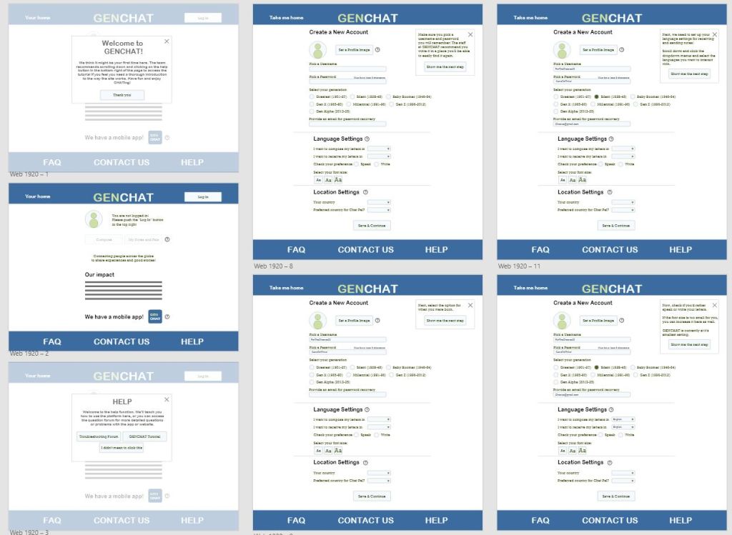
Here is the hi-fi prototype for the desktop version. As a note, the prototype only contains the tutorial aspect because that was the next planned testing step.
Afterthoughts and Considerations
If I were to continue this project, I would begin by testing the hi-fi prototype tutorial with older folks again to see if it does its job. I would also make more versions of different webpage sizes and app sizes if the product were to ever go into production. For this project especially, flexibility of use is a must. If people of all ages and demographics are targeted by this, it has to be simple and broadly appealing. The next steps for this project also include finishing the copy for the question button “explanations” so that users would not have to go back through the tutorial.

Leave a comment