
| Client | Project for Coursera |
| Sector | Web design for mobile and desktop, Online shopping experience |
| My Role | The entire product from research to low-fi prototype testing, to mockups and hi-fi prototype. |
| Project Time | 1 ½ months |
| Software Used | Adobe XD, Microsoft Excel |
Inception of the Project
I noticed a need at my nearby bakery for an online shopping experience. They are a global company originating in Korea without an app or a way to buy without being in person. Their offerings are somewhat typical for a cafe/bakery with some Asian inspired pastries, breads, and products that are available that it would be hard to find elsewhere in the states. Amusingly enough, I did not realize that Tous Les Jours was a large chain before working on this project and doing market research on the company and their indirect/direct competitors.
Therefore, I decided to base the shopping experience on what I would expect users would want for a cafe, and showed it to users to get their feedback on what was working and what was not working.
Work Out the Problem: Personas, User Journeys, and Sitemap
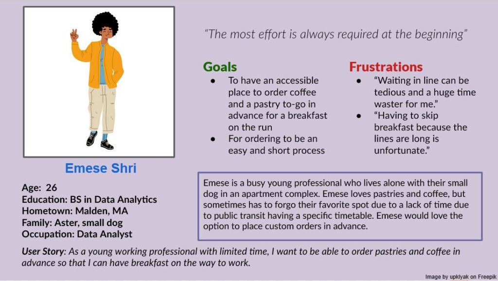
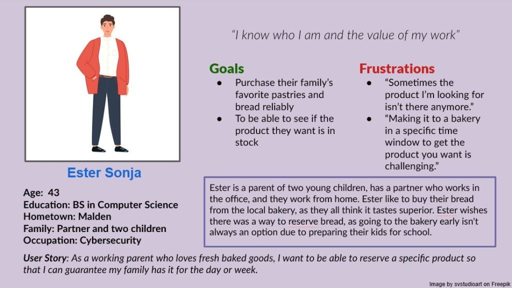
To help guide me through the creation of the shopping experience, I created two personas to represent the client base that it will serve.
If you need screen-reader friendly versions of these images, please explore this page.
Problem Statements
After creating a user story for my personas, I went forward and created a problem statement for each.
- Emese is a busy professional and bakery lover who needs to order online in advance because they do not have time to wait in line.
- Ester is a parent of two who adores fresh rolls and needs to be able to order fresh bread to pick up later because their mornings are busy getting their children ready for school.
This helped me conceptualize what to prioritize in my upcoming design choices.
Research Goals
After getting a better idea on what the problem was that I wanted to solve, I came up with some research goals for my project.
- I want to find out what users want from a shopping experience.
- I want to learn what users feel they are lacking with the current service provided.
Target Audience
Knowing who is buying from Tous Les Jours makes it easier to tailor a product to them, so I did some preliminary research on who goes to cafe/bakeries and what Tous Les Jours is currently marketing towards.
- Higher income families and individuals
- Younger people gravitate towards pastries
- Older adults will families gravitate towards bread/rolls
- Tours Les Jours provides mostly pastries with some bread, so mostly after a young audience
- Higher income families purchase the limited-per-day gourmet cakes for events
Insights from Pre-Production Research
Doing this market research and making the personas helped me come to these conclusions
- Users want an online shopping experience to reserve pastries or cakes up to a day in advance.
- Users want a way to order coffee and pastries in advance for a specific time block.
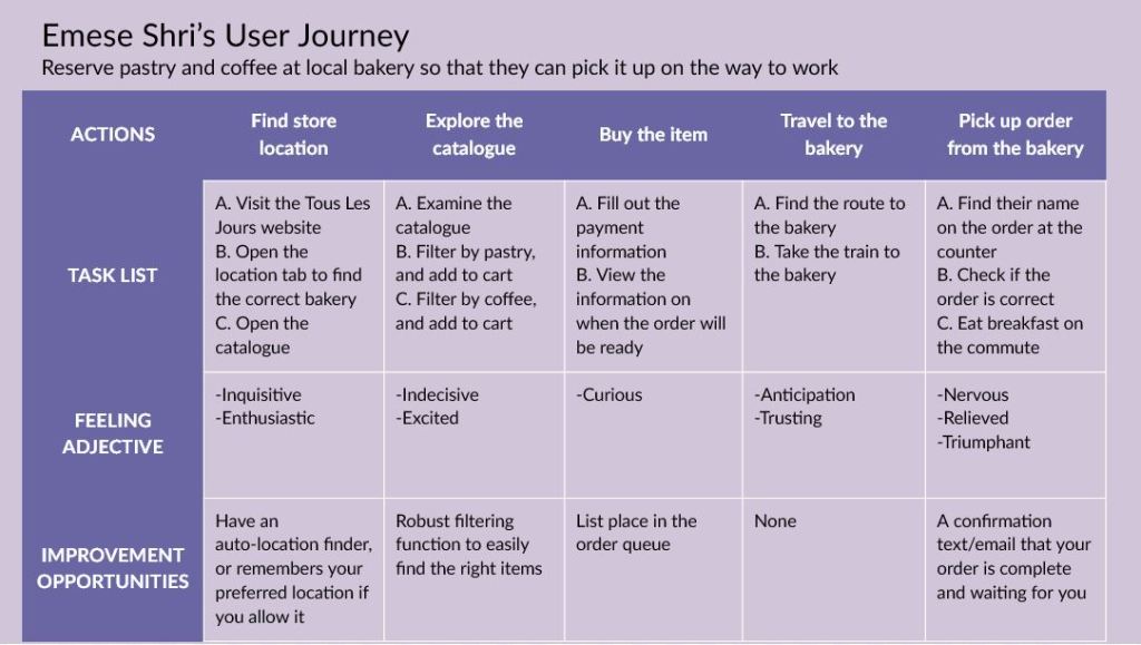
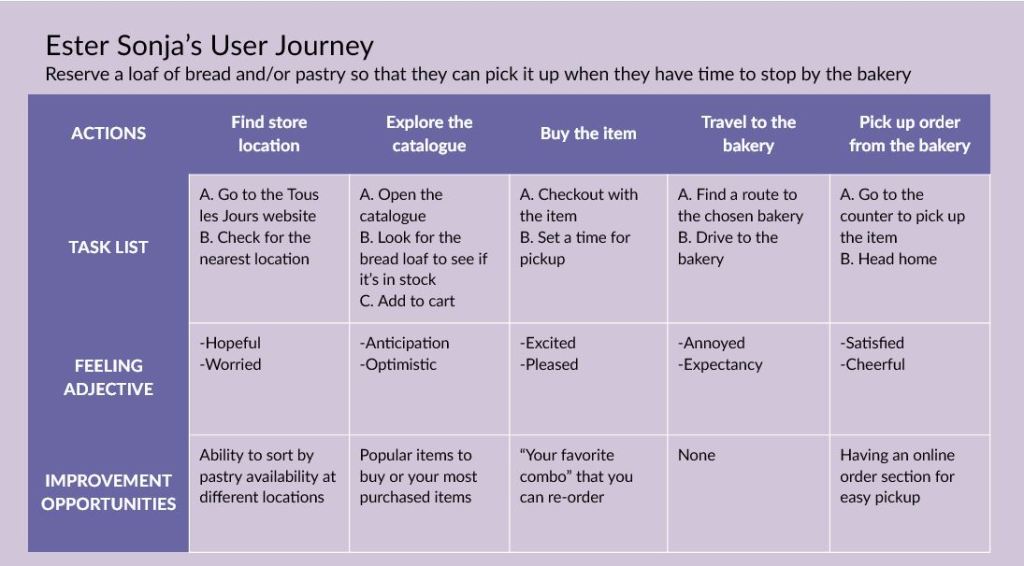
Following this, I came up with a user journey for each persona to see how they would interact with the product, and what they might be feeling throughout the process.
If you need screen-reader friendly versions of these images, please explore this page.
My insights from these user journeys helped me figure out additional features I might want to include in my product, like “popular items,” or having the website remember your favorite location to order from.
With those insights in mind, I made a basic site map for what the website should look like, also taking cues from the current website structure.
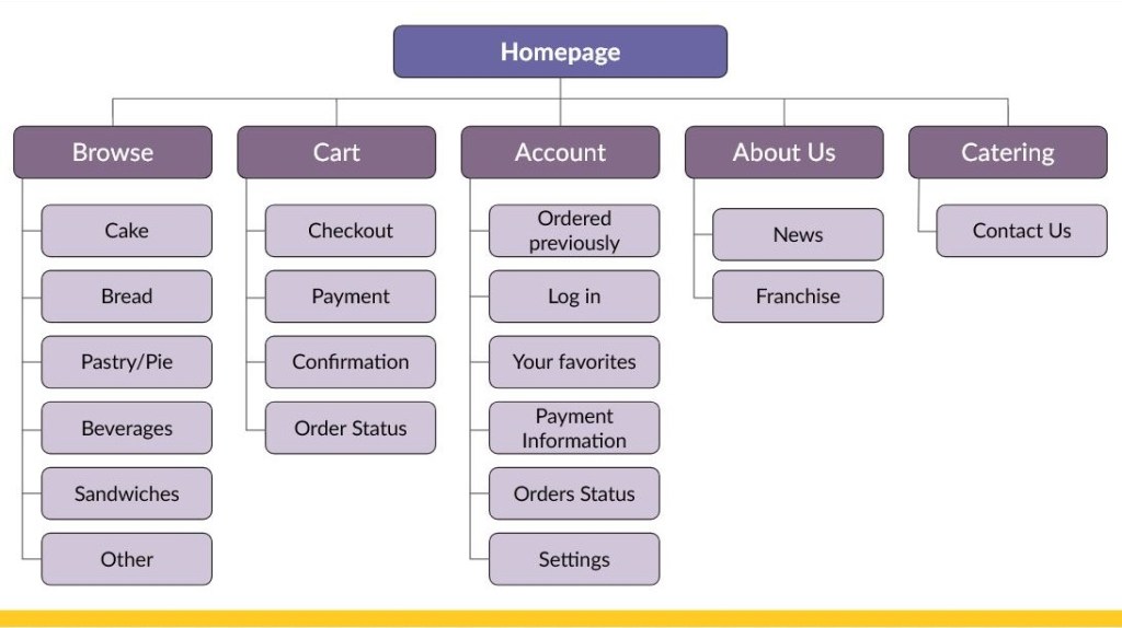
If you need screen-reader friendly versions of these images, please explore this page.
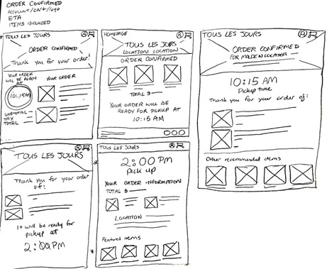
Starting the Climb: Paper and Digital Wireframes
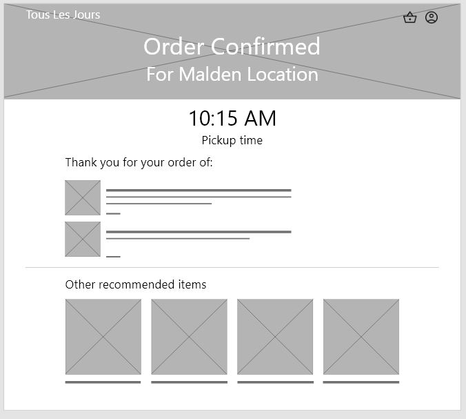
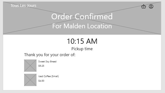
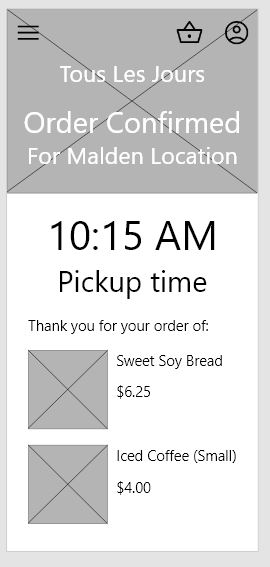
My research gave me a strong direction of where to go with my paper wireframes. I drew out four different screens to get an idea of how I thought the Homepage, Browse, Choose Your Location, and Order Confirmation pages should look, as they were key pages in the user flow.
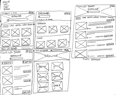
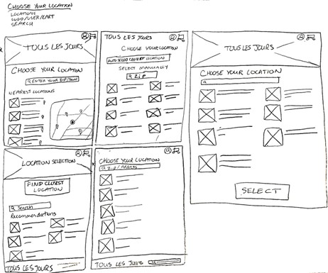
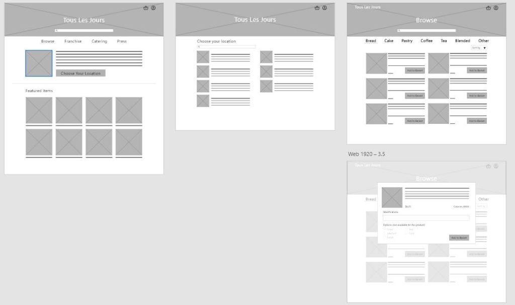
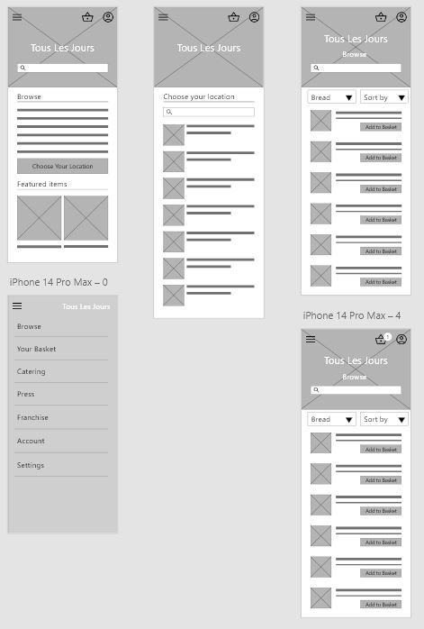
The next step was to take my wireframes on paper and take them to Adobe XD. I made a complete mobile and desktop version of the user flow to make sure that I could ask my testers to explain if my design choices were sound and felt consistent cross-platform.
What’s the Beta?: Prototype, User Testing, and Iteration
After creating digital wireframes in Adobe XD, I made a low fidelity prototype with a user flow that included adding two items from separate categories into your cart. Then, it was time to test. If you’re interested in exploring my prototypes, you can see the desktop and/or mobile version.
My greatest insights from the system usability study were as follows:
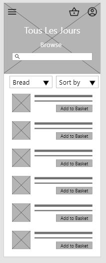
- Based on the theme that users think that they should be able to select their first category, an insight is that the browse page should allow you to select an option instead of defaulting to bread
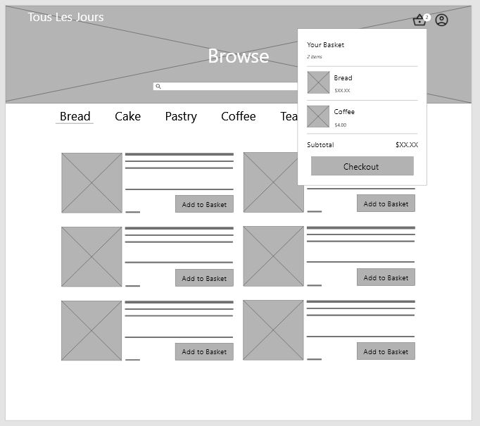
- Based on the theme that users think that there should be an edit button inside the cart and at the checkout page, an insight is that any items added to the cart should be more easily edited and removed by users
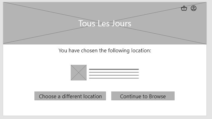
- Based on the theme that users were confused if they selected their location, an insight is that the user flow should include a page that indicates their location has been selected
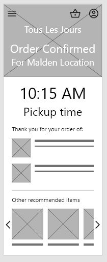
- Based on the theme that users think the recommended items at the end of the user flow were frustrating, an insight is that the recommended items should be included in an earlier point in the user flow or not at all
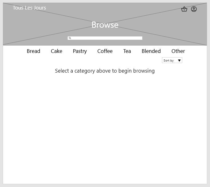
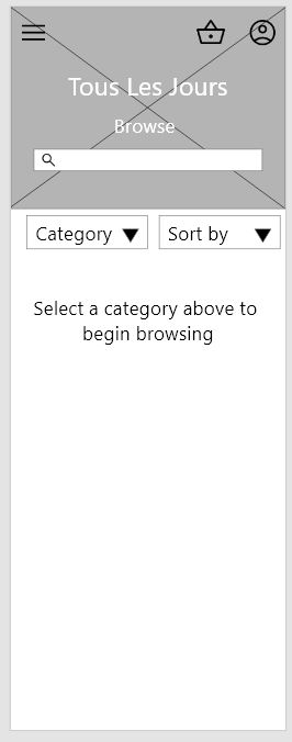
Here’s what I did to address the first theme: I added a blank page with a text prompt for the user to select a category to begin browsing.
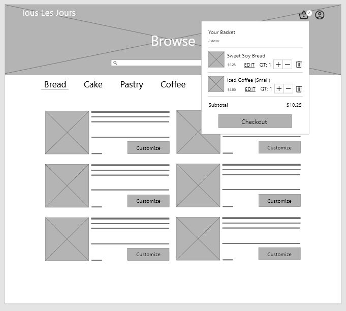
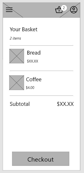
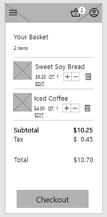
For the second theme, I decided to give the cart a lot more functionality that was also included on the second page. This functionality included a quantity with an add/remove button and a delete button.
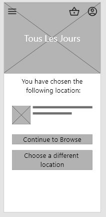
For the third theme, I made sure to add a page where the user confirmed the location.
I left the fourth theme mostly unchanged at this point, but removed featured items from the end of the flow as users rightfully found that frustrating.
Here are my version 2 prototypes for desktop and mobile.
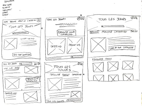
Finishing the Climb: Hi-Fi Prototype
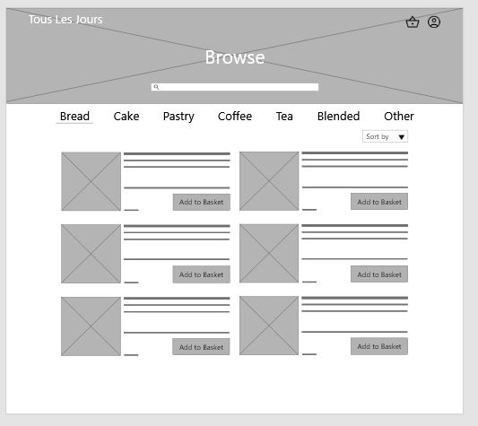
This is where I had another idea to further address the fourth theme from my previous research study by adding featured items to the originally blank landing page for the Browse section. I also revisited the third theme and added a consistent line for where the user was shopping, so they would not forget. I also re-organized the top bar on the desktop version slightly as I realized the user would not be able to access the other pages without first going to the home page. You can see some of my mockups below.
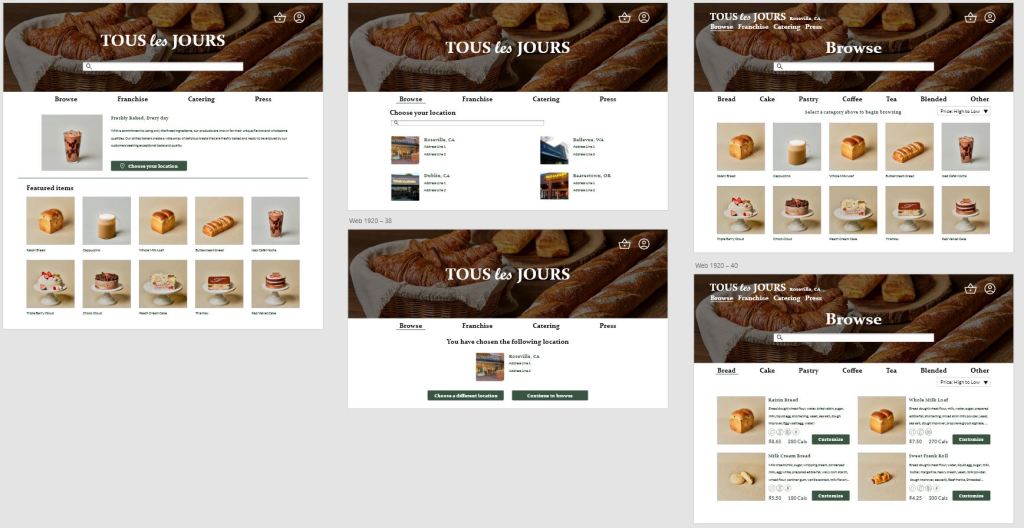
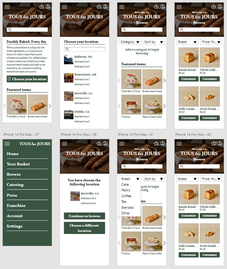
You can find my high fidelity prototypes for desktop and mobile in the Adobe XD links.
Afterthoughts and Considerations
If I were to continue this project, I’d definitely make an app to pair with this website experience, as I would imagine an app experience would be beneficial for a business like Tous Les Jours. I would also run another round of user testing for the high-fidelity prototype to make sure no more changes were needed. Another feature I’d like to expand on is the account functionality, such as adding “Your favorite combos” for easy ordering. The next steps for this website project would be to make annotations and notes for the developers about the heading orders to increase the accessibility of the product, and to make a tablet version of the prototype for easier development.
 Zia Love
Leave a comment