
| Client | Project for Coursera |
| Sector | Design for mobile, Online shopping experience |
| My Role | The entire product from research to low-fi prototype testing, to mockups and hi-fi prototype. |
| Project Time | 3 ½ months |
| Software Used | Figma, Microsoft Excel, Microsoft Powerpoint |
Introduction
When conversing with my friends and family about buying flowers for people, we would often express discontent about the ordering process for flowers on a mobile browser. The process was clunky and could easily cause frustration due to the interface not being easily adaptable to mobile.
People wanted to be able to use their smart phones to easily order flowers for their loved ones, and I set out with that goal in mind. I decided to do this for the flower shop I had consistently ordered flowers from in the past.
What’s Already Out There?
I did a competitive analysis on what other local florists and shops in the area were doing, and none of them had mobile apps to support their shopping experiences yet. The sites were generally very effective on a desktop or tablet, but the limited screen size of mobile phones posed a unique issue where “one size fits all” does not really fly. Therefore, this app would be the first of its kind in this particular area. Review my competitive audit findings.
Testing the Waters: Personas, Simulated Interviews, and User Journeys
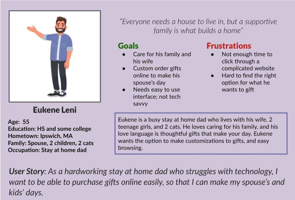
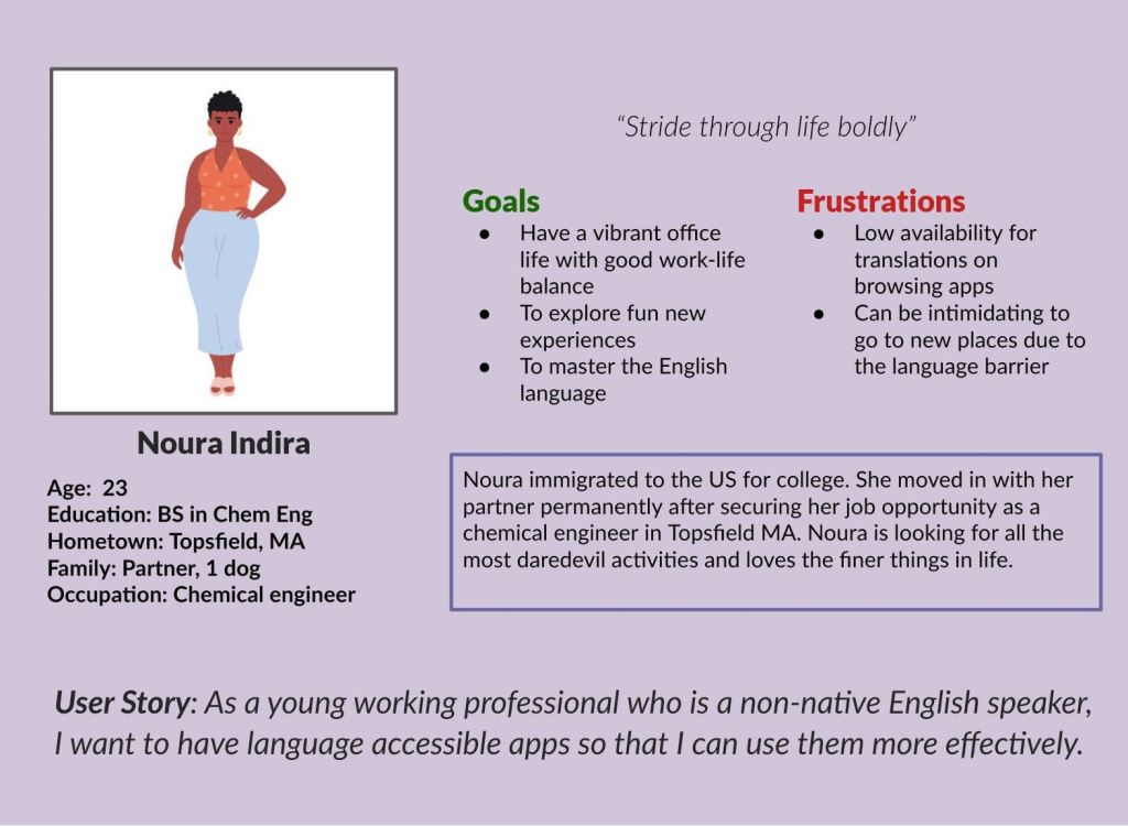
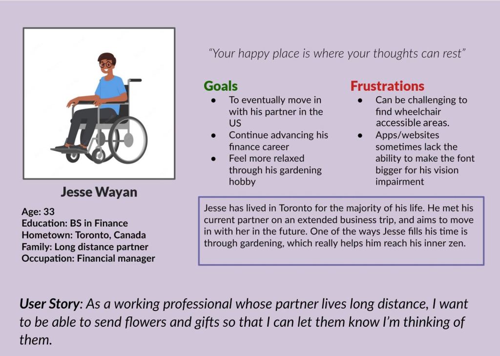
Since there really wasn’t a pre-existing product for this endeavor, I created some personas who would want to use this app to buy flowers.
If you need screen-reader friendly versions of these images, please explore this page.
Problem Statements
I came up with problems statements for each of my personas to get a good idea of what my user group’s main pain points were:
- Eukene is a stay at home dad who needs an easy way to purchase gifts online because he struggles with technology.
- Noura is a young working professional who needs language accessible technology in her internet/app browsing experience because English is not her native language.
- Jesse is an financial manager who needs visually accessible technology because he wants to send gifts to his partner who lives abroad.
I wrote user stories, problems statements, and hypotheses for these personas to try and empathize with them and their personal goals and frustrations. I also conducted faux interviews with some example personas provided by Coursera to try and put myself in as many potential user’s shoes as possible to see what these people would want from the app experience.
To prepare for these faux interviews, I made research goals and thought about the target audience for buying flowers from Ipswich Hearts ‘N Flowers.
Research Goals
- I want to understand how people order flowers and what their needs are in a shopping app.
- I want to identify what functions are associated with a catalog app and how it can be most useful it can be for bouquet customization and ordering.
- I want to understand common frustrations and problems with using ordering apps on mobile and tablet devices.
Target Audience
- People ordering flowers for people in the Ipswich area
- Adults ordering flowers for loved ones or events
- Baby boomers are the largest market for purchasing flowers
- Most people who order flowers are women, or ordering for women
- Include participants of different genders and ability
After conducting the faux interviews and synthesizing the responses to my interview questions, I extrapolated a few insights on what users would want from this mobile application.
Insights from Pre-Production Research
- Customers want efficiency and to minimize clicks required for ordering a bouquet
- Customers want an easy way to filter through and browse bouquets
- Customers want a simple interface that is not overwhelming
- Customers want an additional function that lets you order a customized bouquet, not for it to be an option included with each option
Review my complete interview research.
Following exploring more thoroughly what a user might want for this app, I went through and made User Journeys for the personas I made from before.
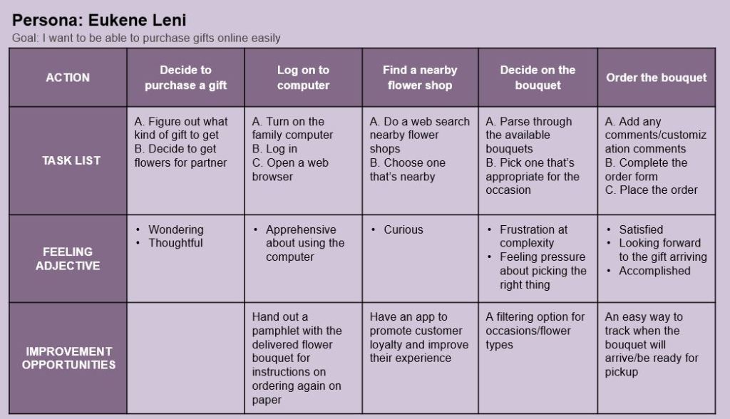
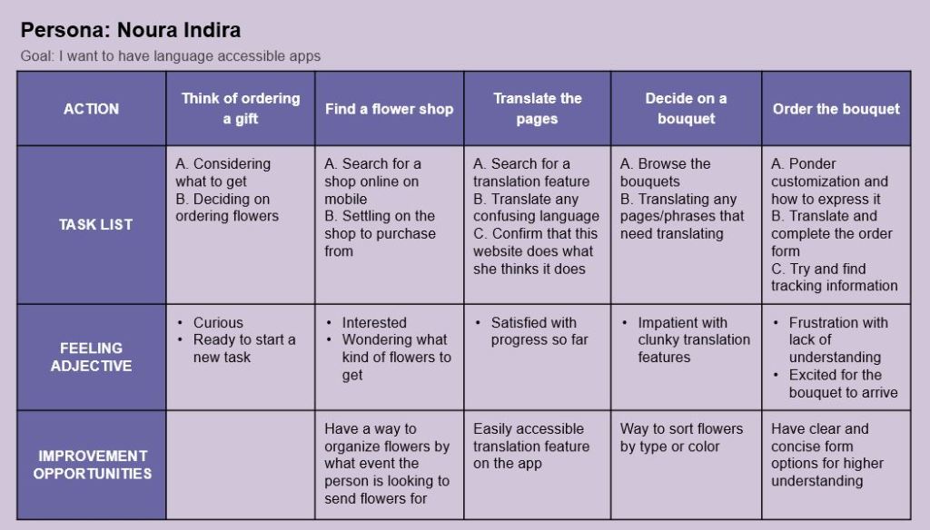
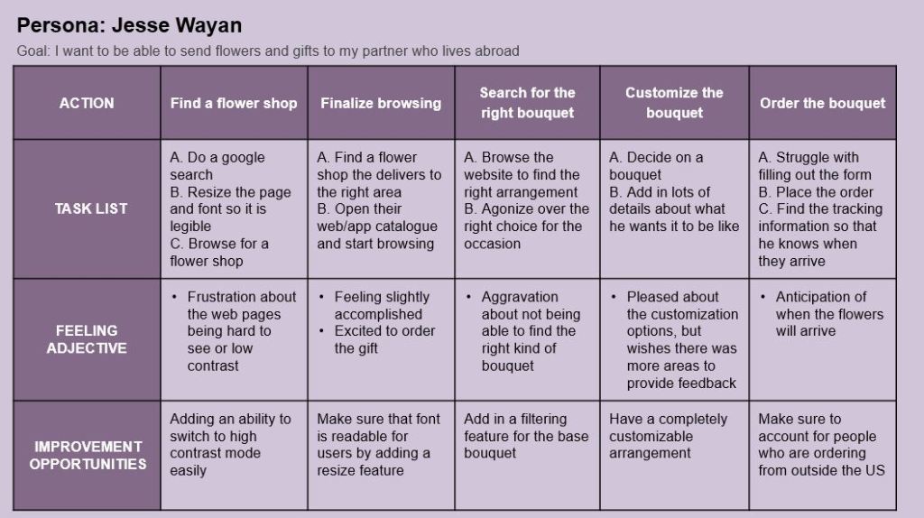
If you need screen-reader friendly versions of these images, please explore this page.
Insights on Potential Pain Points from User Journeys
- Make sure to have a robust filtering feature for finding bouquets
- Easily accessible translation feature and high contrast mode
- An easy way to track your order after you have placed it
Learning to Swim: The Early Planning Phase
After taking some time to understand and empathize with the potential users of this app, I was ready to move on to the idea generating phase with my goal statement in mind:
“Our Flower catalogue app will let users order flowers online easily which will affect users who want to order a gift but are short on time, by making the ordering process faster and easier to use. We will measure effectiveness by how many bouquets are ordered on the app versus the website.”
To begin my process of designing this app, I came up with a basic user flow chart to wrap my head around what pages I would need to brainstorm for.
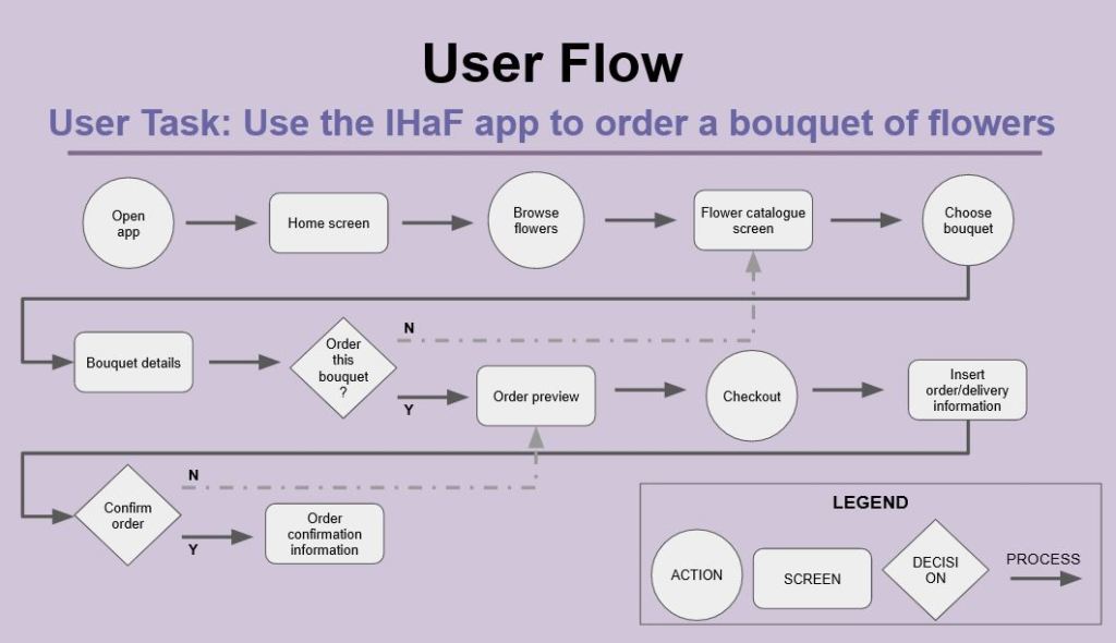
If you need screen-reader friendly versions of this image, please explore this page.
With this conceptualization of what exactly I needed to build, I started making a big picture and close-up storyboard set.
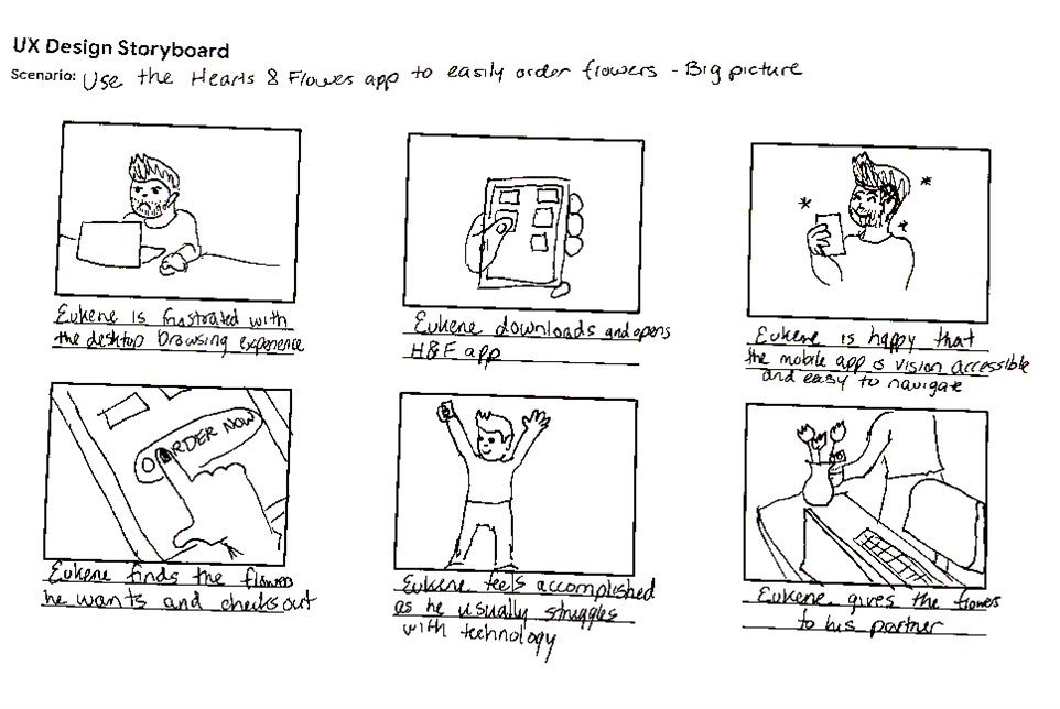
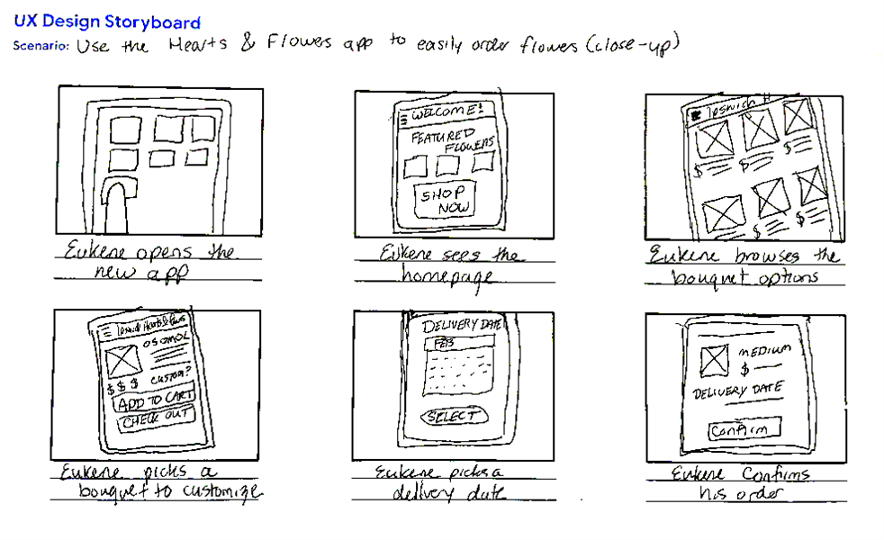
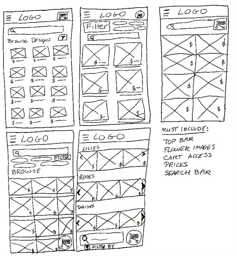
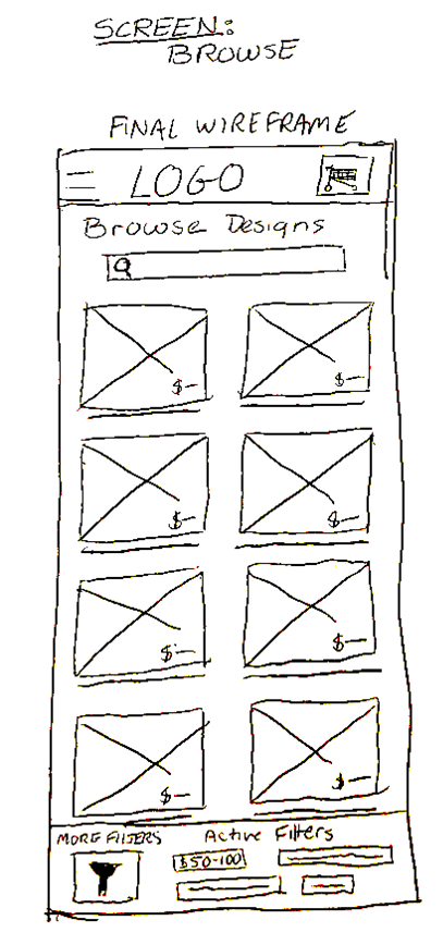
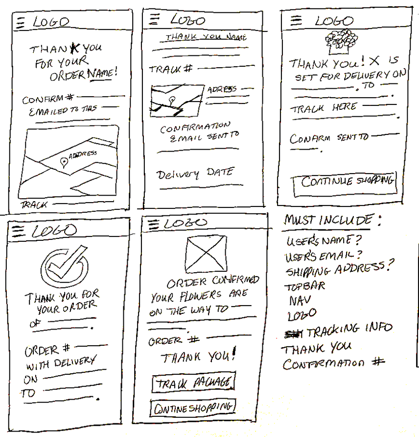
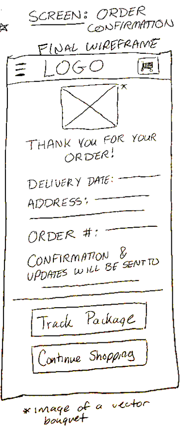
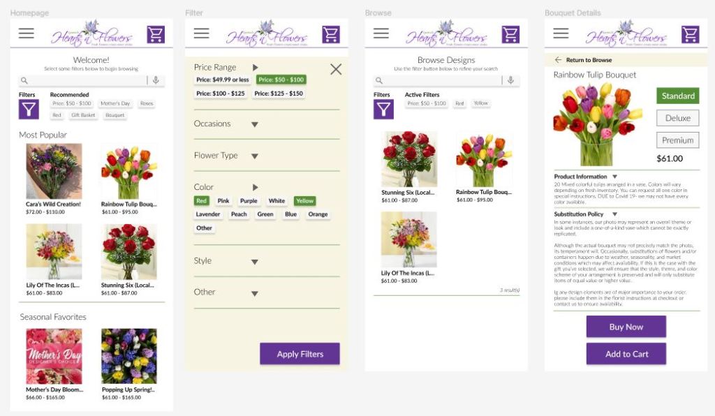
Doing those storyboards gave me a better idea of what I might want my app to look like. Going even further, I started brainstorming wireframes for a handful of different screens in my user flow above: homepage, browse, bouquet details, and order confirmation. Each of these pages got 5 brainstormed ideas, with a final wireframe mockup combining my favorite ideas. Below you can fine the browse page and order confirmation processes.
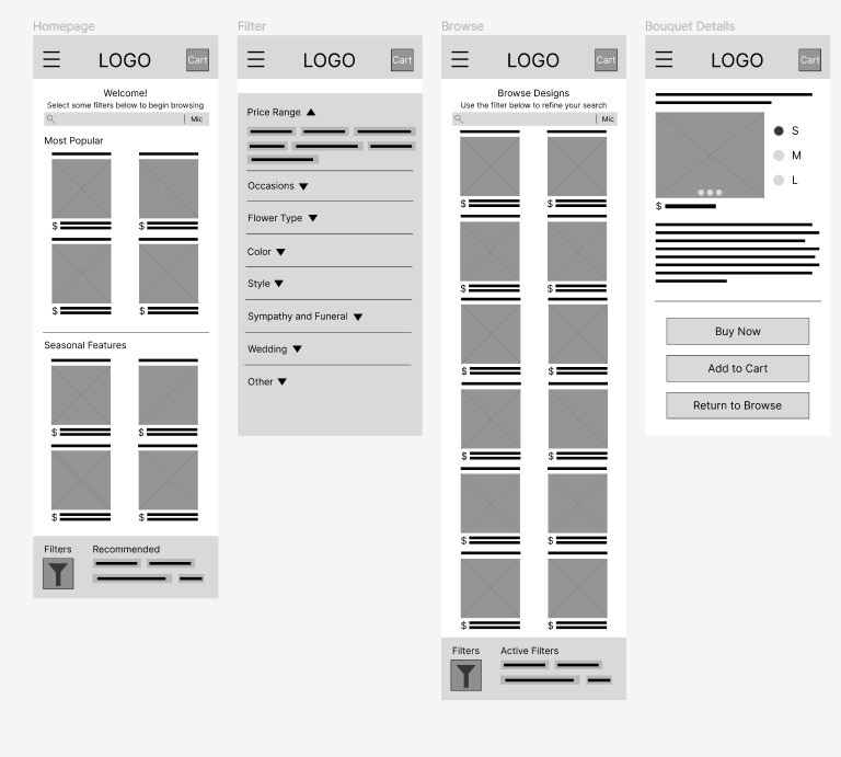
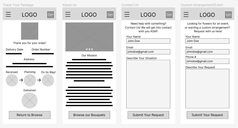
After the brainstorming session, I took these paper wireframes and made a digital version in Figma.

Then, I hooked those wireframes up into a lo-fi prototype to test with users.
Doing Laps: Prototypes, User Feedback, and Iteration
Taking those wireframes from before and connecting them where it made sense gave me a solid prototype to test with users. I took this prototype and conducted a usability study with 5 testers.
Conducting Preliminary Research
Here are the research plan, research goals, research questions, and key performance indicators for my study:
Research plan: The sales team at Ipswich Hearts ‘N Flowers want to know if ordering bouquets on the app is intuitive to users. The team needs to know if the app is usable and if it reduces drop-off rates, and where users may have trouble with the ordering experience.
Research goals: Determine how useful the Ipswich Hearts ‘N Flowers app is for user usability. Find if it reduces the rate of drop-off in users due to frustration with the ordering process.
Research questions:
- Is the user flow of the app intuitive?
- Are there parts of the app that the users get stuck on?
- Are users consistently able to find the features on the app?
- Do we need to make more changes to the design to make it more usable?
- Are there more features we need to include in the app to make it a complete experience?
Key Performance Indicators:
- Time on task
- Drop-off rates
- Conversion rate
- System usability scale
With this background in mind, I set about conducting my usability study. The themes I gathered from the research were as follows:
P0 Themes
- 4 out of 5 participants mentioned the filter function did not work as they’d expect it to. The majority of these comments center around the filter function not being near the search bar.
- 3 out of 5 participants expressed anxiety about not being able to revisit their order after placing it.
- 3 out of 5 users were puzzled by the way the navigation works and could not figure out how to get back to previous pages.
P1 Themes
- 3 out of 5 users expressed displeasure with the checkout form: they thought it was incomplete and in the wrong order.
- 3 out of 5 users mentioned worrying about the gift message and it’s functionality.
P2 Themes
- 2 out of 5 users thought this page was odd in the way it was displayed. The delivery information was not obvious enough.
After extrapolating so many themes from my affinity diagram, I went forward and made some changes to the original wireframe and prototype.
Addressing the P0 Themes
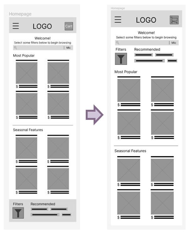
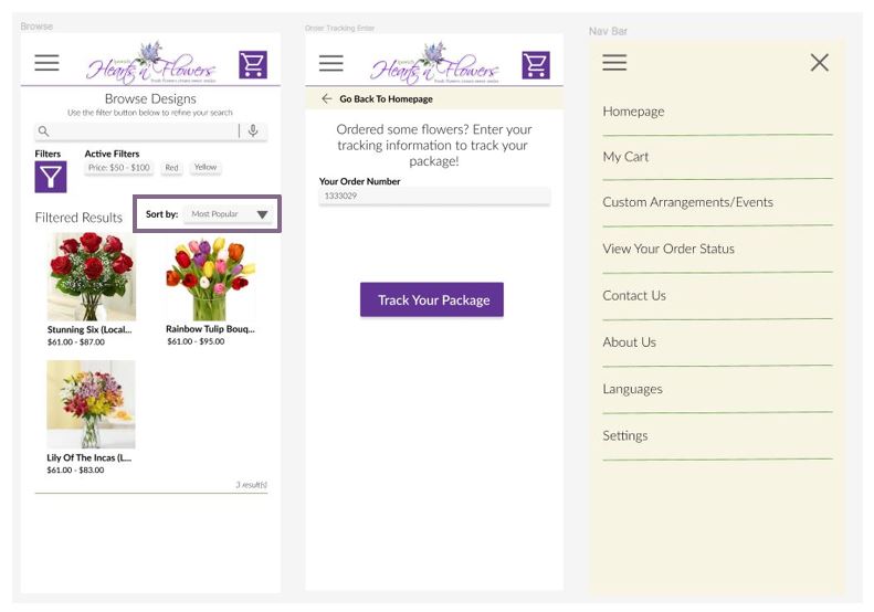
The largest issue of my app according to users was the confusing placement of the filter function, so it was the aspect I addressed first. I moved the filter functionality up close to the search bar, where the users were looking for it first.
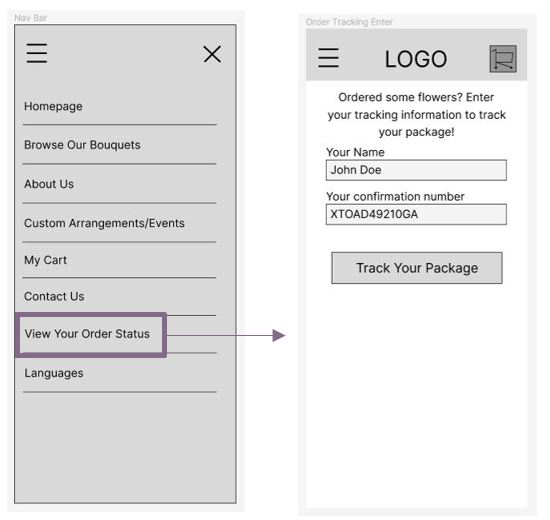
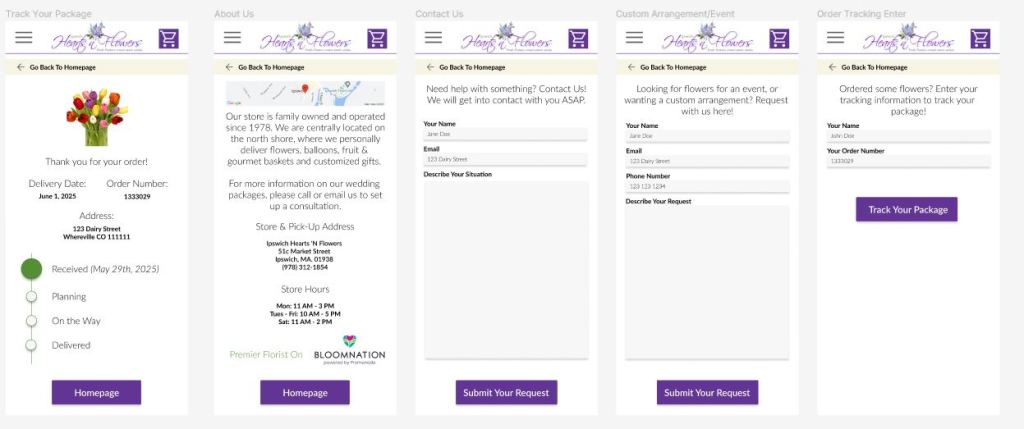
The next two issues were tied for importance, but I tackled the missing page first. I added a “View Your Order Status” spot to the navigation menu to allow users to revisit their tracking information when they provide the confirmation number.
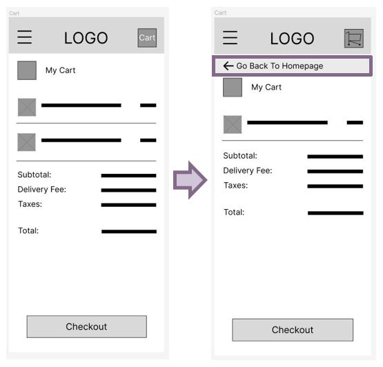
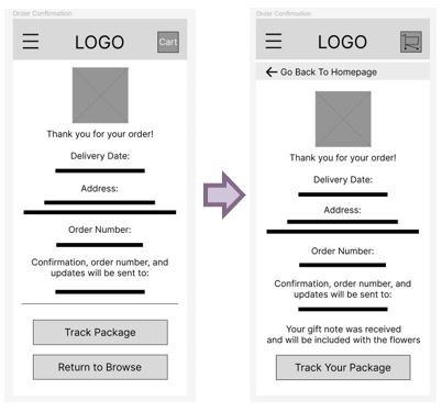
The last P0 issue was the most work to fix. In order to remove confusion about moving backwards through the flow in lieu of just cancelling by switching to another page, I added a back button banner to each page where you could not directly return to browse.
Addressing the P1 Themes
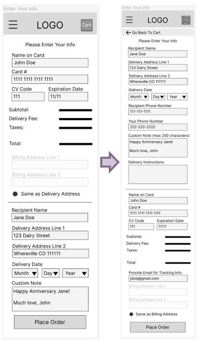
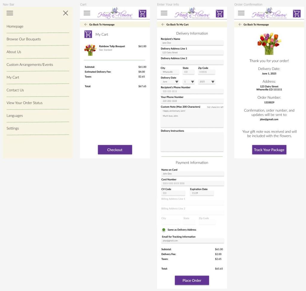
For the most part, these issues were minor tweaks. In the “Enter Your Info” page, I flipped the order of Billing and Delivery information and reviewed some checkout forms from other businesses to make sure I was not missing any information from it. As for the gift message, I just added a line above the button section about the message being received (if it was included).
Addressing the P2 Themes
For the P2 issue with the graphic display on the “Track Your Package” page, I waited until I took the wireframes to the mockup stage to handle that, as I felt it would not be a good use of my time at this point.
If you’re interested in interacting with my finalized lo-fi prototype, you can follow the hyperlinked text.
Swimming the Race: Mockups and Hi-Fi Prototype
Once I felt confident in my lo-fi prototype, I took my product to the next stage: making mockups. I reviewed the Ipswich Hearts ‘N Flowers website and made a very brief style guide to follow from while designing all of my new screens. This made my process much faster.
At this point, I also decided to tackle the order tracking page and how the progression chart was displayed.
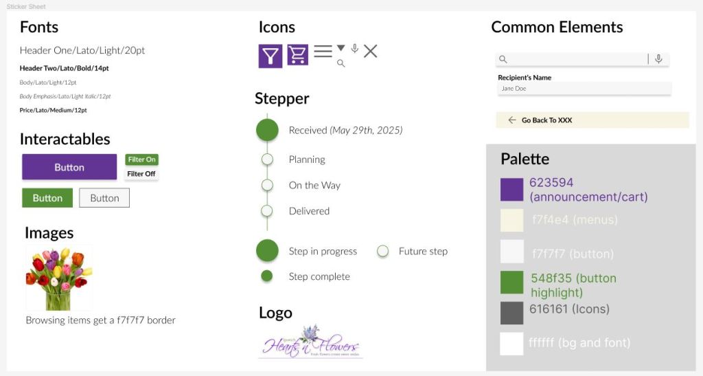
After making my mockups, I copied re-used and potentially helpful elements into a sticker sheet and categorized them to get a better idea of how consistent I was being in my design. This really helped me conceptualize and expand upon what my style guide was.
Next, I worked on animations and hooking up the prototype so I could run another usability study. You can review my hi-fi prototype if you’d like.
Doing the second usability study was enlightening, as it brought to light a handful of small issues that would make the overall experience better. The three issues were thus: there was no “sort by” functionality, the navigation bar was in a non-intuitive order, and participants wanted to know why their name was required to track their orders. The most in depth issue was working with the Nav Bar, as everyone had slightly different suggestions on how it should be organized. In the end, I moved About Us much lower, and bumped up My Cart and View Your Order Status.
Additional Accessibility Considerations
In the future, I would want to make a version with larger font and a single-row bouquet scroll to assist in vision accessibility. In my design, I considered high contrast already, and the colors comply with the WCAG standards. In the actual app, google translate would be built in for easy translation functionality. Lastly, buttons are large and high contrast with large or bold font for easy pressing.
Final Thoughts
Hopefully, this kind of app would make bouquet ordering more accessible and easier for everyone to do, just like my goal at the beginning of this process.
If I were given the chance to re-do this project, I would have loved to make all of the steps happen faster but I was still learning what the process was and made some mistakes on the way that required re-visiting. It was all too easy to blaze forward and forget what my end goal actually was. I had to keep remembering to cross reference the excellent research work I did in the beginning instead of having it all sit fresh in my mind, since I was learning the processes of how to do user-centered design throughout this project. I think the next project that I work on will go much faster.
In addition to the accessibility functions I want to add to this app, I would want to go a step higher to a company called Bloomnation. Bloomnation is the larger organization that Ipswich Hearts ‘N Flowers is part of, and they would most likely want to have a consistent experience across all of their florists so they can sell more bouquets in a wider area than just the Ipswich area. I would market this app to them with ability to adapt to what florist in area the user wants to deliver to.
If you like my work, be sure to visit my project page and connect with me on LinkedIn!
